Accessibility, usability and UX: what’s the difference?

Yamila FigueroaWebxya
Accessibility, usability and user experience solve different problems. Telling them apart helps teams build products that are usable and inclusive.
Introduction
Accessibility, usability and user experience are often discussed together, and for good reason. All three influence whether a digital product works well for the people using it.
But they are not interchangeable.
Accessibility asks whether people with different abilities can access and use a product. Usability focuses on how effectively and efficiently people can complete tasks. User experience considers the broader quality of the interaction, including how understandable, satisfying, frustrating or trustworthy that experience feels.
These distinctions matter because a website can perform well in one area and still fail in another.
A form may technically meet accessibility requirements but remain unnecessarily confusing. A beautifully designed interface may feel effortless to most users while being impossible to operate without a mouse. A product can pass automated accessibility checks and still create a poor experience for someone using assistive technology.
Understanding the relationship between accessibility, usability and user experience helps teams look beyond individual metrics and evaluate digital products more completely.
Accessibility: can people use it?
Accessibility is concerned with whether people can access and interact with a digital product regardless of disability.
That includes people who navigate with keyboards rather than mice, use screen readers or magnification, depend on captions, require stronger contrast, use voice input or interact with digital interfaces in other ways.
Accessibility therefore focuses heavily on barriers.
Can someone reach every interactive element without a mouse? Does important information remain available when images cannot be seen? Are forms structured so assistive technologies can communicate labels, instructions and errors correctly? Does the interface remain usable when text is enlarged or motion is reduced?
These questions are not primarily about whether an interaction is elegant or pleasant. They ask something more fundamental: is the experience available to the person at all?
This is where standards such as WCAG become useful. They provide teams with a shared framework for identifying many of the barriers that can prevent people with disabilities from perceiving, understanding or operating digital content.
If you are new to the subject, our introduction to web accessibility explains this foundation in more detail.
Accessibility is therefore a necessary baseline for digital quality, but meeting accessibility requirements does not automatically mean the resulting experience is easy to use.
Usability: how easily can people use it?
Usability looks at what happens once someone can access the product.
Can they understand how it works? Can they complete their task without unnecessary effort? Do they make avoidable mistakes? Can they recover when something goes wrong?
A checkout form, for example, might be fully operable with a keyboard and correctly announced by a screen reader. From an accessibility perspective, those are important strengths.
But the same form could still ask for information in a confusing order, use unclear labels, provide poor error messages or require too many unnecessary steps.
In that case, the interface may be accessible while still having poor usability.
Usability is concerned with qualities such as effectiveness, efficiency and ease of use. It asks whether the design supports the task the user is trying to complete rather than merely making the interface technically available.
This distinction is especially important because compliance-focused processes can sometimes stop once accessibility criteria have been satisfied. Yet users do not experience a website as a collection of success criteria. They experience a sequence of decisions, instructions, actions and responses.
A technically correct interaction can still demand too much effort.
User experience: how does the whole interaction feel?
User experience, or UX, is broader still.
It includes accessibility and usability concerns, but also considers the overall perception of the product before, during and after an interaction.
A user may be able to access a service and complete a task efficiently, yet still leave with a poor impression because the experience feels impersonal, unpredictable or untrustworthy.
Conversely, a product may create a strong first impression through excellent visual design and smooth animation but become frustrating once the user attempts to complete something important.
UX includes practical questions, but also emotional and contextual ones.
Does the product feel trustworthy? Does it communicate clearly? Does the interface behave in ways users expect? Does it create unnecessary anxiety? Does it respect the user's time? Does the experience feel coherent from one part of the product to another?
Those qualities are difficult to reduce to a single checklist because they emerge from the entire interaction.
This is one reason UX should not be treated simply as another term for visual design. Typography, color and motion contribute to an experience, but so do content, performance, navigation, accessibility, error handling and the structure of the service itself.
Where these disciplines overlap
Accessibility, usability and UX answer different questions, but in practice they constantly influence one another.
Clear form labels can improve accessibility by helping assistive technologies communicate the purpose of each field, while also improving usability for everyone. Strong visual hierarchy can help users understand a page more quickly and support people who need clearer structures. Predictable navigation can reduce cognitive effort and make the overall experience feel more reliable.
The boundaries therefore are not rigid.
A decision made for accessibility can improve usability. A usability problem can become an accessibility barrier for some users. Poor performance can damage the overall user experience and disproportionately affect people using older devices, magnification software or limited connectivity.
The important thing is not to decide which discipline “owns” every problem. It is to recognize that each one provides a different lens for evaluating the same product.
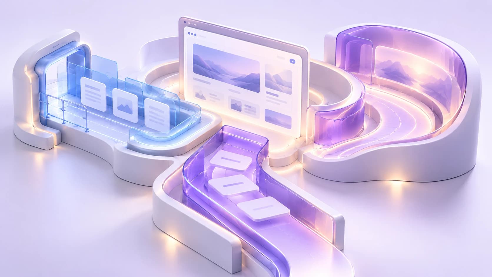
Accessibility, usability and user experience overlap, but they answer different questions about the same digital product.
An accessible product can still have poor UX
One of the most useful distinctions becomes clear when we look at products that technically satisfy accessibility requirements but remain difficult to use.
Imagine an online application form.
Every field has a proper label. Keyboard focus is visible. Error messages are programmatically associated with the relevant inputs. The form can be completed using assistive technology.
Those are meaningful accessibility achievements.
But now imagine that the form contains forty fields on a single page, uses unfamiliar terminology, provides no indication of progress and only reveals errors after the user attempts to submit everything.
The product may be accessible in important technical ways and still provide a frustrating experience.
The same problem appears elsewhere. A navigation system can have correct semantic markup while remaining unnecessarily complex. A modal can manage keyboard focus properly while appearing so frequently that it interrupts the task. A page can have excellent heading structure while presenting far more information than the user needs.
Accessibility removes barriers to participation. It does not automatically remove every source of confusion, inefficiency or frustration.
That is why accessibility testing should not replace usability testing. They evaluate different qualities.
Good UX can still exclude users
The opposite problem is equally important.
A product can receive enthusiastic feedback from usability studies and still contain serious accessibility barriers if the people involved in those studies represent too narrow a range of users.
Imagine a polished web application tested extensively with people who use a mouse and modern laptops. Tasks are completed quickly, the interface is intuitive and participants describe the experience as excellent.
Yet the application contains custom controls that cannot be reached with a keyboard.
For the people included in the research, the UX may genuinely be very good. For a keyboard-only user, the product may be unusable.
This reveals an important limitation in statements such as “our users had no problems with it.” Which users were included? Under what conditions? Using which devices and interaction methods?
User experience research is only as inclusive as the people and circumstances represented in it.
Good UX for one group does not guarantee access for another.

A product can feel effortless for one user while still placing barriers in front of another.
Why organizations should evaluate all three
Organizations often evaluate digital quality through separate processes.
Accessibility may be reviewed through an audit. Usability might be tested during research sessions. UX may be discussed through customer feedback, analytics or product design reviews.
Each approach provides useful information, but relying on one alone creates blind spots.
An accessibility audit can identify important barriers without revealing whether a workflow is unnecessarily difficult. A usability test can expose confusing interactions while missing users who depend on assistive technologies. Satisfaction metrics can indicate how people feel about a product without explaining which groups were unable to use it in the first place.
A stronger evaluation process combines these perspectives.
Teams should ask whether the product is accessible, whether tasks can be completed efficiently and whether the broader interaction supports confidence, understanding and trust.
The order also matters.
If someone cannot access a feature, asking whether the experience is pleasant is irrelevant. Access comes first. But once access is possible, usability and experience still matter.
For organizations, this means treating accessibility as part of product quality rather than a separate compliance stream. It also means recognizing that good UX cannot be defined only by the experience of the easiest users to reach.
A better model: inclusive user experience
A more useful goal is not to choose between accessibility, usability and UX, but to design experiences in which all three reinforce one another.
An inclusive user experience begins with access. People should be able to perceive information, navigate interfaces and complete essential interactions using the technologies and interaction methods they depend on.
From there, the experience should also be understandable and efficient. Accessible interactions should not merely function; they should make sense.
Finally, the complete journey should feel coherent, trustworthy and appropriate to the context in which people are using it.
This does not require merging the three disciplines into a single concept. Their distinctions remain valuable because they help teams identify different kinds of problems.
The better approach is to evaluate them together.
When planning new digital work, accessibility should be considered from the first design decisions rather than added later. Usability should be evaluated with real tasks and realistic contexts. UX research should include enough diversity to reveal experiences that a typical user sample might overlook.
The result is a more complete definition of digital quality.
A product should not only be possible to use. It should be practical to use, understandable to use and designed so that the quality of the experience does not depend on fitting an assumed idea of the “average” user.
That is the difference between simply meeting requirements and creating an experience that genuinely works for more people.
Keep reading

NGOs do not need to solve every accessibility issue at once. Start with critical services, set a baseline, stop creating new barriers and build a roadmap.

Accessibility
Accessibility debt: the problem nobody talks about
Accessibility debt builds up when an inaccessible decision repeats across components, content, code and processes. The longer it spreads, the more it costs.
If these challenges sound familiar, let’s talk about your context.
Start a conversation