Why “Mobile First” isn’t enough in humanitarian contexts

Yamila FigueroaWebxya
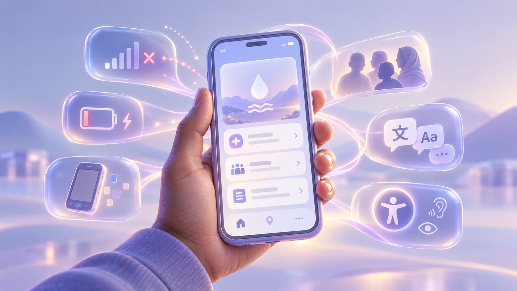
Mobile first solves screen size. Humanitarian services must also work with unreliable connectivity, limited devices, costly data and shared access.
Introduction
A service can be designed mobile-first and still fail on a phone.
Imagine an organization testing a new digital service on a smartphone. The layout adapts correctly, navigation fits the smaller viewport, buttons are large enough to tap, and the content hierarchy survives the move from desktop to mobile. From a responsive-design perspective, the product is working as intended.
Now change the conditions without changing the screen size. The connection disappears after the first page loads. The phone is several years old and struggles with a large JavaScript bundle. The user is carefully rationing mobile data. The battery is low and there may not be a reliable place to charge it later. The device belongs to a family rather than one person, and the service is being used in a second or third language. Halfway through a long form, a request fails and the information already entered disappears.
The viewport is still mobile. Almost everything that determines whether the service is genuinely usable has changed.
This is why mobile-first humanitarian design needs a broader frame than responsive layout alone. Mobile-first solved an important design problem by forcing teams to stop treating small screens as an afterthought. In humanitarian, development, and public-interest contexts, however, screen size is often only one constraint among several that interact with one another: connectivity, hardware, the cost of data, access to electricity, language, literacy, disability, privacy, environmental conditions, and whether a device is personal or shared.
UNHCR describes many of these barriers directly in its digital inclusion work, including unreliable power, poor cellular coverage, limited connection speeds, the cost and availability of hardware and services, digital literacy, language, and the availability of accessible content. The implication for product teams is significant. Designing for a phone is not necessarily the same thing as designing for the conditions in which that phone will be used.
A more useful question is not simply whether the experience fits on mobile, but what remains usable when the conditions around the screen become imperfect.
Mobile first solved an important problem
Mobile-first emerged in response to a real failure in digital design. For years, desktop interfaces were treated as the primary product and mobile experiences were created later by compressing, hiding, or rearranging whatever had already been designed for a larger screen.
Starting with the smaller viewport forced teams to make harder choices earlier. Content had to be prioritized. Navigation had to become more deliberate. Touch targets mattered. Dense layouts had to justify themselves. The mobile experience could no longer be treated as a reduced copy of the desktop one.
Those lessons remain useful, particularly in contexts where a phone may be the primary or only practical way to access a digital service. UNHCR's recent work on mobile-enabled and offline-first solutions reflects this reality, explicitly describing mobile-first design for low-end smartphones as a combination of lightweight interfaces, minimal data use, compatibility with older devices, and interaction suited to small screens and touch.
The limitation appears when the word mobile begins to stand in for all the other conditions a user might face.
A high-end smartphone on a stable connection with plenty of storage, unlimited data, a full battery, and one private owner is a mobile device. So is an older handset with little available memory, an intermittent connection, expensive data, an aging battery, and several people relying on it. Both may have a similar viewport. They do not offer the same operating environment.
Responsive design can adapt an interface to their screens. It cannot, by itself, account for everything else that determines whether the service can be reached and completed.
But screen size isn't the only constraint
In humanitarian products, constraints rarely arrive one at a time. Poor connectivity can interact with limited hardware. A long download becomes more consequential when data is expensive. A process that assumes uninterrupted attention becomes harder when the phone is shared or the user has only a short period of access. Accessibility barriers may compound all of these conditions rather than exist separately from them.
That is why the context of use has to be treated as part of the design problem, not as a collection of edge cases to handle later.
Connectivity
“Slow internet” is often too simple a description of the problem. A connection may be available, disappear for several minutes, return with high latency, lose packets, or switch repeatedly between networks. A user can begin a task online and finish it in a completely different connectivity state.
That distinction matters because a product that is merely slow behaves differently from one that becomes uncertain. When a request takes twenty seconds and then fails, the user may not know whether information was submitted. When the interface appears to freeze during a network transition, repeating an action may create a duplicate. If essential content only exists after a fresh request, a connection that disappears at the wrong moment can make the service effectively unavailable.
UNHCR has increasingly treated mobile-first and offline-first as complementary principles rather than alternatives. In its Digital Innovation Fund guidance, mobile-first addresses low-end devices, lightweight interfaces and minimal data use, while offline-first asks that essential content and functionality remain available without a constant connection and synchronize when connectivity returns.
Not every service needs to function fully offline. The principle is more useful than that: teams should identify which parts of the experience truly require a live connection and which parts do not.

The same screen size can hide very different conditions of use. Designing for mobile does not automatically mean designing for the network, device, power, privacy, or access constraints around it.
Device capability
Viewport width tells us surprisingly little about the device rendering the page.
Two phones with similar dimensions may differ substantially in processor speed, available memory, storage, browser support, battery condition, and operating-system age. A responsive layout can fit both screens perfectly while the application itself performs very differently on each device.
This is especially relevant when teams equate visual simplicity with technical lightness. A clean interface can still depend on a large JavaScript bundle, multiple web fonts, high-resolution media, expensive client-side rendering, and background requests the user never sees. Responsive design does not make those dependencies disappear.
For services intended to reach broad populations, testing only on current flagship hardware creates a distorted picture of performance. The useful question is not merely whether a page can run on a lower-end device, but whether essential tasks remain responsive enough to complete without excessive waiting, crashes, or resource consumption.
Data cost
Performance discussions often frame page weight as a matter of convenience: fewer bytes mean a faster experience. In some contexts, however, those bytes are also part of the cost of accessing the service.
That changes the significance of seemingly small implementation decisions. An autoplaying video, several font files, oversized images, repeated analytics requests, or an unnecessarily large JavaScript bundle can consume data a user is paying for directly. A service may be technically available and still be expensive enough that people ration how often they use it.
UNICEF's Internet of Good Things illustrates a different approach. The platform was designed to make information available on basic as well as smartphones and has been offered free of charge in many countries through partnerships with mobile network operators. The important lesson is broader than zero-rating: the cost of reaching information is part of access.
This does not mean stripping every interface down to text. It means treating network weight as a product decision, particularly when non-essential media or code competes with the content people actually came to retrieve.
Power availability
Digital design often assumes that electricity is invisible infrastructure. The device will be charged before use, there will be another outlet later, and battery level is the user's concern rather than the product's.
That assumption is not universal. UNHCR identifies lack of reliable power and difficulty accessing digital infrastructure among the barriers that can prevent forcibly displaced and stateless people from participating fully in digital services.
Once charging is uncertain, time and battery become design constraints too. Long processes that require the screen to remain active, repeated downloads after failed sessions, constant location access, heavy animation, or tasks that cannot be paused all ask more from the device than their interface alone suggests.
A product team does not need to estimate the battery cost of every interaction to take this seriously. It can begin by asking whether the essential task requires unnecessary time, repeated work, or continuous activity that could have been avoided.
Language and literacy
Making a service available in several languages is important, but translation alone does not guarantee comprehension.
People may use a service in a language they speak but do not read fluently. Administrative terminology may be unfamiliar even when every word is technically correct. Instructions written for professionals can become difficult to follow when they are transferred unchanged into a public-facing interface. Digital literacy varies as well: interactions that feel obvious to a product team may depend on conventions that a user has had little reason to learn.
UNICEF's guidance for designing around girls' digital realities recommends designing for different levels of digital literacy and, where appropriate, using audio or visual support for people with lower literacy. The important qualification is where appropriate. Audio is not automatically more inclusive, pictograms are not universally understood, and video can create new bandwidth and accessibility problems. These choices need to be validated with the people who will actually use them.
The deeper principle is to reduce unnecessary interpretation. Clear language, explicit actions, useful error messages, familiar concepts, and a hierarchy that makes the next step understandable can make a service more resilient even before additional formats are considered.
Accessibility
Disability does not sit outside these other conditions. It intersects with them.
A person using assistive technology may also be on an old device. Someone with low vision may be dealing with a dim screen outdoors. A user navigating by keyboard or switch input may lose a task when the connection fails. Someone relying on text-to-speech may encounter content in a language that is not well supported by the device available to them.
UNHCR includes limited availability of accessible content for people with disabilities among the barriers to digital inclusion, while UNICEF's work on accessible digital solutions emphasizes designing with people with disabilities rather than treating accessibility as a final technical adjustment.
Many of the practices that support accessibility also improve resilience more broadly: semantic HTML, clear hierarchy, native controls, understandable language, predictable interactions, visible status, and fewer unnecessary dependencies. Accessibility and resilience are not interchangeable, but they often reinforce each other because both challenge assumptions about an ideal user operating under ideal conditions.
Privacy and shared devices
One of the most persistent assumptions in digital product design is embedded in a simple phrase: your phone.
A mobile device is not always personal. It may be borrowed, shared within a household, used through an assisted-access point, or available to someone only for limited periods. UNICEF's digital inclusion guidance explicitly calls attention to shared devices and the privacy risks they can create.
That changes how apparently convenient features should be evaluated. Persistent sessions, visible notifications, saved form history, autofill, cached sensitive information, or account recovery methods may expose information to the next person who uses the device. Logging out may need to be more obvious than it would be in a product designed around private ownership.
Shared access can also affect task design. A person may need to stop halfway through a process because someone else needs the phone, which makes safe saving and resumption more than a convenience.
The broader lesson is that mobile-first should not quietly become personal-smartphone-first. Device ownership is another condition that needs to be understood rather than assumed.
Designing for imperfect conditions
The usual product flow is designed around success. The page loads, the user enters information, the request completes, and the next screen appears. Error states are often added later as exceptions around that ideal path.
Resilient services treat degraded conditions as part of the normal design space.
That does not mean assuming everything will fail. It means deciding in advance what should happen when something does. If a request is interrupted, can entered information be preserved? If a user returns later, can the task resume? If current data cannot be retrieved, can the interface distinguish previously available information from live information? If a non-essential image never loads, does the page still communicate what matters?
The distinction is important because failure in a humanitarian or public-service workflow can have a larger cost than irritation. Re-entering a long application may consume more data, more battery, and more time. An ambiguous submission state may cause a person to repeat a request or assume incorrectly that it was received. A workflow that starts over after interruption may be especially difficult on a shared device.
A resilient product therefore tries to protect the task rather than preserve every enhancement. As conditions deteriorate, secondary features can disappear before essential information, navigation, entered data, and the primary action do.
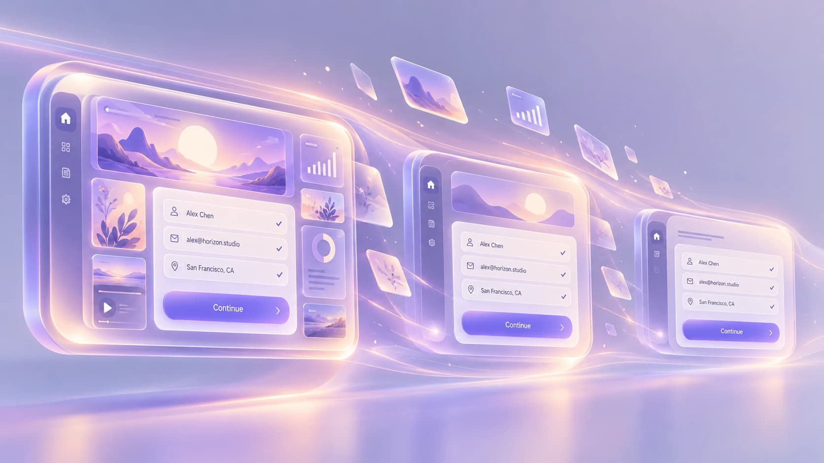
Resilient experiences do not need every enhancement to survive every condition. They protect the information and actions people need most.
Progressive enhancement matters again
Progressive enhancement is sometimes described as an older web-development philosophy, but the underlying idea is highly relevant to modern services: begin with a reliable functional foundation and add richer capabilities when the environment can support them.
For a content page, that foundation might be semantic HTML, meaningful links, readable text, and forms that can be submitted through conventional browser behavior. JavaScript can then improve transitions, validation, state management, or interaction without becoming the only route to the underlying task.
For a more application-like service, the boundary will be different. Some workflows genuinely need client-side functionality. The point is not to force every product into a no-JavaScript architecture; it is to identify what has become dependent on JavaScript simply because the implementation made it convenient.
Progressive enhancement creates a useful discipline because it forces a product team to distinguish essential capability from enhancement. When those two categories are blurred, a minor failure in the enhancement layer can make the entire service disappear.
Reduce dependency on JavaScript where possible
JavaScript is not the problem. Unexamined dependency is.
Modern frameworks make it possible to create sophisticated, fast and highly interactive experiences, including experiences that work well in difficult environments. But every critical task that depends entirely on successful client-side execution adds another condition that has to hold: the script must download, parse, execute, hydrate correctly, and continue running within the resources available on the device.
When that chain is justified by the experience, it may be the right trade-off. When essential content needs a large bundle merely to become visible, or a basic form becomes unusable because hydration fails, the product has made its core function dependent on conditions that may not always exist.
The useful question is therefore not whether a humanitarian service should use JavaScript. It is what should stop working when JavaScript does.
For many products, the answer should not be “everything.”
Server rendering, conventional links, native browser behavior, careful code splitting, restrained third-party scripts, and fewer client-side dependencies can all increase the number of conditions under which the essential experience remains available. The exact technical choices will vary, but the design principle is stable: complexity should justify the dependency it introduces.
Make failure understandable
Technical resilience is only half of the problem. Users also need to understand what state the service is in.
An intermittent connection creates uncertainty that a simple error page does not resolve. Did the request fail before anything was sent, or after the server received it? Is the information on screen current or cached? Did the application save the form locally? Is it safe to press the button again? Will doing so create a duplicate?
“Something went wrong” answers none of these questions.
A useful failure state explains what happened in terms the user can act on, makes clear what has been preserved, and provides a realistic next step. If the system has saved the person's answers locally, it can say so. If it cannot guarantee that a submission was received, it should not imply otherwise. If retrying is safe, the interface can make that route explicit. If nothing can be done until connectivity returns, that limitation should be understandable rather than hidden behind an indefinite spinner.
This is also where honesty in interface design matters. A reassuring message that overstates what the system knows can be more harmful than a precise explanation of uncertainty.
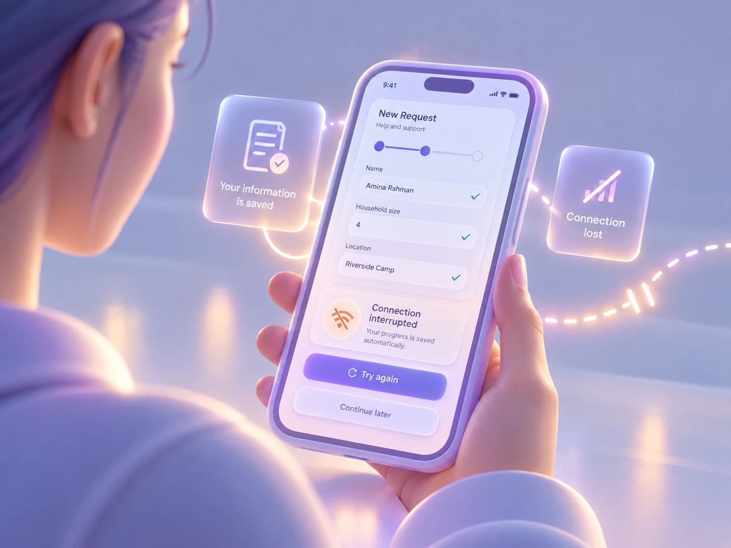
Failure is part of the interface. A resilient service makes clear what happened, what was preserved, and what the user can do next.
Think beyond mobile-first: resilience-first
Mobile-first remains useful because it asks teams to design deliberately for a constrained surface instead of treating it as a reduced version of desktop. What humanitarian contexts reveal is that the surface is only one part of the constraint.
A resilience-first approach asks what happens to the essential experience when real-world conditions deteriorate and then designs around preserving that core task. It does not assume that every product should work fully offline, remove imagery, avoid JavaScript, or reduce itself to a basic interface. Nor is it a euphemism for designing a lower-quality experience for people in lower-resource contexts.
It is a way of making dependencies visible.
| Mobile-first asks… | Resilience-first also asks… |
|---|---|
| Does the experience fit the screen? | Does the essential task survive poor or intermittent connectivity? |
| Does touch interaction work well? | Does the service remain usable on limited or older hardware? |
| Is content prioritized for a small viewport? | Is essential content affordable to load and practical to retrieve? |
| Does the layout adapt responsively? | Can the user recover from interruption or failure without starting over? |
| Does it work on a mobile device? | Does it still work under the conditions in which people actually have access? |
For one service, resilience may mean making critical information available offline. For another, it may mean preserving a partially completed form across a failed request. Elsewhere it could mean offering a lightweight version, reducing unnecessary downloads, supporting an older browser, making logout unmistakable on a shared device, or rewriting instructions so that the task can be understood without specialist vocabulary.
The point is not to predict every difficult condition. It is to stop designing the best-case environment as though it were neutral.
Mobile-first helped digital teams stop treating desktop as the default. Humanitarian and public-interest services require another shift: stable connectivity, modern hardware, inexpensive data, reliable electricity, private device ownership, fluent literacy, and effortless interaction cannot be treated as defaults either.
Designing for a smaller screen is useful. Designing for the conditions in which people actually need the service is more important.
That is the difference between mobile-first and resilience-first.
- Digital Resilience
- Low Connectivity
- Responsive Design
- Digital Inclusion
- Humanitarian Technology
Keep reading

NGOs do not need to solve every accessibility issue at once. Start with critical services, set a baseline, stop creating new barriers and build a roadmap.

Accessibility
Accessibility debt: the problem nobody talks about
Accessibility debt builds up when an inaccessible decision repeats across components, content, code and processes. The longer it spreads, the more it costs.
If these challenges sound familiar, let’s talk about your context.
Start a conversation